Better Workplaces Kaimera
Employee preferences for WFH means workplaces need to utilise office spaces as a tool to connect with staff. In Better Workplaces, AdNews looks at how agencies use office design to entice staff to come in and create a company culture worth staying for.
Nestled in Surry Hills' Elizabeth Towers sits independent media agency Kaimera's spacious corner office with abundant natural light, plenty of lush greenery and panoramic views.
The office is in one of Sydney's most convenient spots, just minutes away from Central station, a light rail on its doorstep and close to the vibrant Holt Street dining precinct.
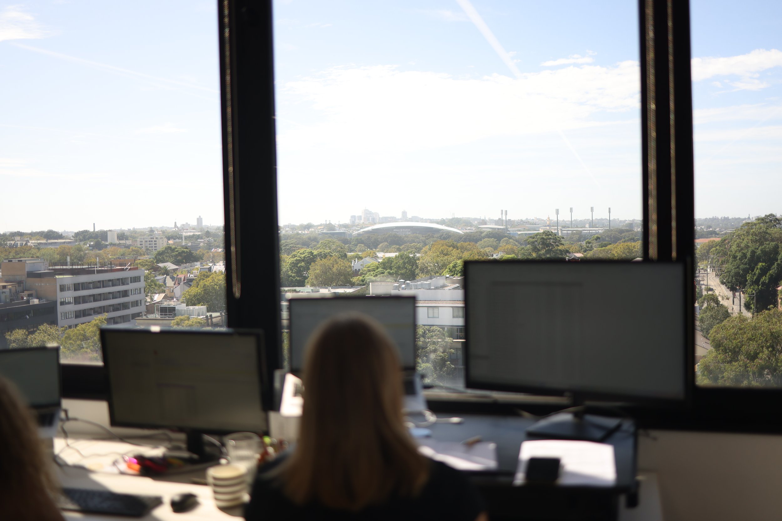
View from staff desk.
Lobby.
Notably Kaimera's favourite sandwich spot City Edge is just a five minute walk away.
"Before we signed on the dotted line to move into the office, we first had to ensure City Edge’s lease was longer than ours," partnerships and marketing manager Ella Dalton said.
"That’s a mistake we made in our previous office and one we will not be making again."
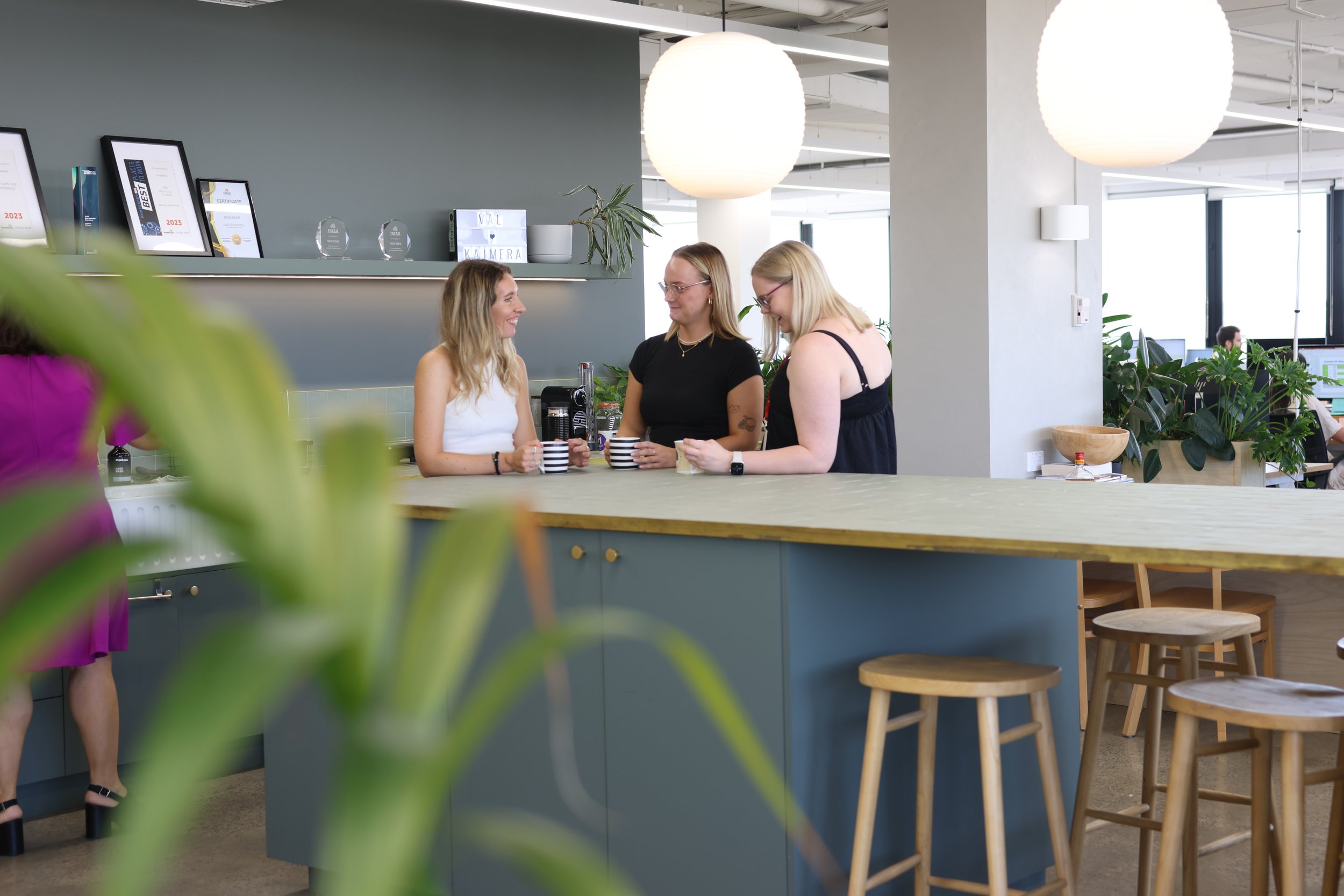
Kaimera staff in the office's communal area.
The agency enlisted designer Micaela Campagna of DEAR HENRI in 2022 to complete the office's final design and oversee the fit out.
In hand with Kaimera's operations manager and agency founders, the office's endgame design was simple: craft an office that sparks collaboration, community, flexibility, and sustainability.
Adding to the charm, the office is also home to some canine companions.
Overview of desks.
Biophilic design principles were embedded within the office layout, with natural shapes, forms, light and space all utilised to recreate a natural environment Harmony Behr, agency operations manager, told AdNews.
"A significant number of plants were used to bring the outdoors inside, allowing us to captilise on the abundant natural light that streams through windows on three sides of the office," Behr said.
"This creates an almost greenhouse-like space, which of course is aesthetic but provides fresh air to the office.
Casual work/eat areas.
Flexibility of space was also key to ensure the growing agency was accommodated for, carving out spaces for in-person activities like brainstorming, focused work, and tech-savvy meeting rooms.
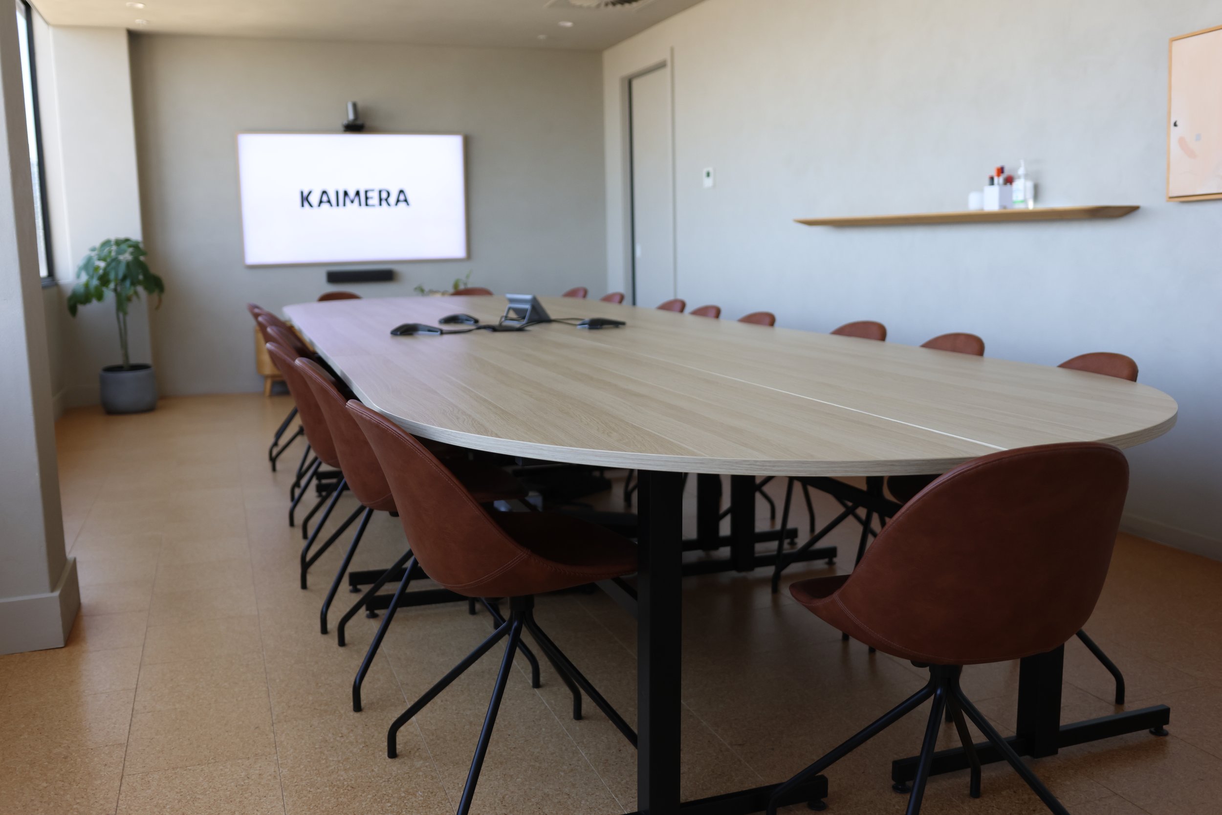
"We also designed the smaller telephone 'booths' for more intimate meetings to ensure larger spaces were optimised for video meetings," Behr said.
The large meeting room.
Meeting rooms.
A strategy library and whole agency meeting area was incorporated in the open-plan layout, serving as a place to collaborate and share, where staff can come together as a collective.
"Our layout is a dynamic canvas, adapting seamlessly to the ebb and flow of the workday. The office is flexible, allowing us to grow further without impacting the feel, function or people’s personal space," Dalton said.
Casual areas
Casual work/eat areas.
The centralised kitchen played a big role in us trying to design a space that felt like a family home, with a huge island bench.
"It ensures we can gather as a team in a less formal setting, whether it be entertaining media partners, a quick team briefing, connecting over lunch as friends or Friday afternoon drinks," Behr said.
Kitchen and communal area.
Team meeting at kitchen bench.
With client teams and specialties in mind, the office ensures a dedicated seat for each of the employees.
"No hot desking here— just a cozy spot for every team member, allowing us to nurture collaboration and camaraderie," Dalton said.
"An occasional reshuffle keeps things fresh.
"We also have hot desks for media owners and clients to be used if they so wish."
Overview of staff desks.
While the building itself holds no known historical anecdotes, an exciting upgrade is underway, featuring a rooftop entertaining area and garden, new end-of-trip facilities, basement upgrades, and lobby enhancements.


